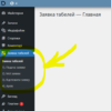
HTML Select: hidden placeholder, highlight, and dynamic urgency indicator
In HTML forms, <select> is often used to choose the priority or urgency of a request.
Usually, at the top, a placeholder option is added:
—— Urgency ——
However, the default version has a problem: this text appears in the dropdown, which looks messy.
We’ll cover:
-
standard
<select> -
improved version with hidden placeholder
-
select text highlighting
-
dynamic color and text indicator
1. Standard version
<select name="urgency" style="width:100%">
  <option>---- Urgency ------</option>
  <option value="low">Low</option>
  <option value="medium">Medium</option>
  <option value="high">High</option>
  <option value="critical">Critical</option>
</select>
Cons:
-
Placeholder appears in the dropdown
-
Can be selected again
-
Real choice not visible
2. Improved version with placeholder
<select name="urgency" style="width:100%">
  <option value="" selected hidden>---- Urgency ------</option>
  <option value="low">Low</option>
  <option value="medium">Medium</option>
  <option value="high">High</option>
  <option value="critical">Critical</option>
</select>
-
selected— shows text by default -
hidden— hides it from dropdown -
value=""— proper placeholder for forms
3. Select text highlighting
<style>
select { color: #999; }
select.low { color: green; }
select.medium { color: #555; }
select.high { color: orange; }
select.critical { color: red; font-weight: bold; }
</style>

<select name="urgency" id="urgency" style="width:200px">
  <option value="" selected hidden>---- Urgency ------</option>
  <option value="low">Low</option>
  <option value="medium">Medium</option>
  <option value="high">High</option>
  <option value="critical">Critical</option>
</select>


<script>
const select = document.getElementById('urgency');
select.addEventListener('change', function () {
  this.className = '';
  if (this.value) this.classList.add(this.value);
});
</script>
4. Dynamic urgency indicator with color box and text
<style>
#statusText { font-weight: 600; }
.status-box { width: 16px; height: 16px; border-radius: 3px; background: #ccc; }

.low { color: #a4ffa4; }
.medium { color: #1efb1e; }
.high { color: yellow; }
.critical { color: red; }

.box-low { background: #a4ffa4; }
.box-medium { background: #1efb1e; }
.box-high { background: yellow; }
.box-critical { background: red; }
</style>

<div style="display:flex; align-items:center; gap:10px;">
  <select name="urgency" id="urgency" style="width:200px">
    <option value="" selected hidden>---- Urgency ------</option>
    <option value="low" style="background: #a4ffa4;">Low</option>
    <option value="medium" style="background: #1efb1e;">Medium</option>
    <option value="high" style="background: yellow;">High</option>
    <option value="critical" style="background: red;">Critical</option>
  </select>

  <span id="statusText">Urgency:</span>
  <span id="statusBox" class="status-box"></span>
</div>

<script>
const select = document.getElementById('urgency');
const statusText = document.getElementById('statusText');
const statusBox = document.getElementById('statusBox');

select.addEventListener('change', function () {
  statusText.className = '';
  statusBox.className = 'status-box';

  if (!this.value) {
    statusText.textContent = 'Urgency:';
    return;
  }

  statusText.classList.add(this.value);
  statusBox.classList.add('box-' + this.value);

  const selectedText = this.options[this.selectedIndex].text;
  statusText.textContent = `${selectedText}`;
});
</script>
Result
-
The text “Urgency” changes color depending on the selection
-
The color box shows the urgency level
-
The text dynamically shows the selected value
-
Everything updates automatically when the selection changes
Latest posts in this category
-
 Activation and Initialization Hooks in WordPress: Where and When to Create Tables
220
Activation and Initialization Hooks in WordPress: Where and When to Create Tables
220
-
 How to Create a Custom Table in WordPress via functions.php: A Complete Guide to MySQL Data Types
212
How to Create a Custom Table in WordPress via functions.php: A Complete Guide to MySQL Data Types
212
-
 How to Create a Custom Admin Menu in WordPress: A Simple Guide for Beginners
169
How to Create a Custom Admin Menu in WordPress: A Simple Guide for Beginners
169
-
 Customizing the WordPress Login Page: Logo, Colors, Background Image & Custom CSS
204
Customizing the WordPress Login Page: Logo, Colors, Background Image & Custom CSS
204
-
 How to Change or Completely Remove the Text in the WordPress Admin Footer
214
How to Change or Completely Remove the Text in the WordPress Admin Footer
214
Popular posts
 How to Display the Visitor’s IP Address on a Website Using PHP? 575
  Adding Meta Description and Keywords in WordPress 410
  How to Detect an AdBlocker on Your Site Using JavaScript 322
  How to Add a Currency Widget to the WordPress Admin Dashboard 252
  Activation and Initialization Hooks in WordPress: Where and When to Create Tables 220
Leave a Reply